Tuesday, November 24, 2009

CD COVER: MAKING OF THE BACK COVER

1. I again used Adobe Photoshop CS4 to create the back of the CD cover. This will make the task simpler as it will create a likeness to the front design, as i will be using the same effects etc.

2. I then started a new piece, and measure up the back of a normal CD cover. the measurements were 150mm by 117mm, including 6mm on either side for the sides of the CD cover.
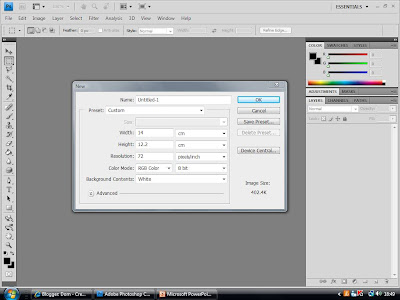
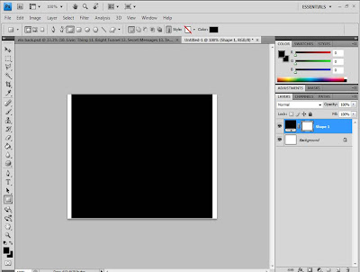
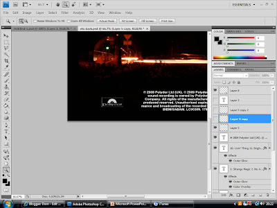
3. I divided it so that the sides were seperated from the central square. I next used the Fill Tool to give it a black background. This will match the front cover and give the entire cover continuity.


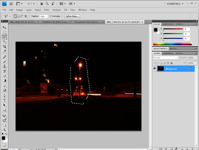
4. I then Copied the logo image from the front cover, and Pasted it in. Opening up the image I wished to use for the back cover and using the Polygonal Lasso Tool, i roughly cut round the part of the image i wanted, then Cut and Pasted it in the back cover.

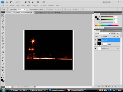
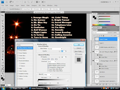
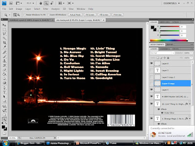
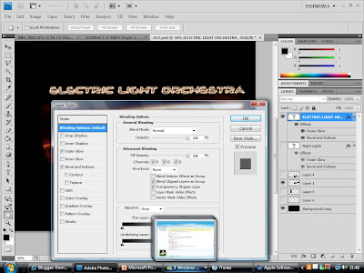
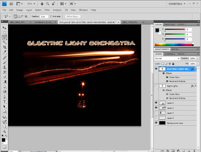
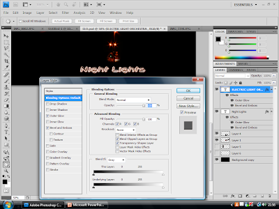
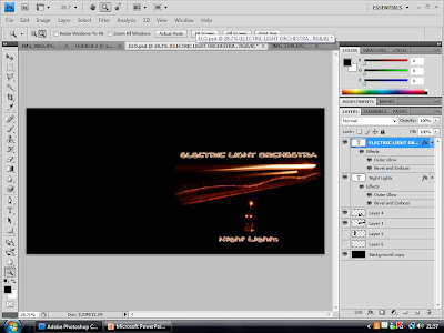
5. After using the Tranform Tool to scale down the image to the correct size, i placed it in the desired position. I then used the Horazontal Type Tool to add the list of tracks for the album. This consists of two colloms. I then used the Blending Options to make them the same style as the title text on the front cover, including effects such as Outer Glow etc.


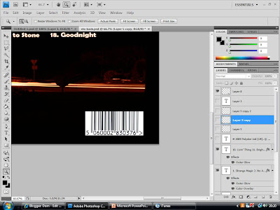
6. I then then Copied an image of a barcode and Pasted it onto my back cover. Using the Transform Tool, i scaled it to an appropriate size and placed it in the bottom right corner, as found through the conventions of CD covers.

7. As also found in my research, i used the Horazontal Type Tool to create a small print with all the legal infomation on it. I copied the small print of a previous ELO album, but update all the dates etc. This will give the CD cover a further realistic look through detail.


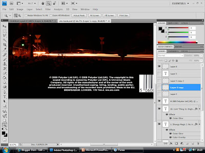
8. I then took a picture of the "Polydor" logo, and used the Transform Tool to scale it down, simular to the size of the small print, and positioned it next to the legal information.

9. I next concentrated on the sides of the cover. I began by using the Fill Tool, and making the background of sides black, to go with the rest of the outside cover so far.
10. I then added the band name and album title using the Horizontal Type Tool, then used the Transform Tool to rotate it to fit on the side. I then Copied and Pasted the text, and rotated it so it fit on the other side.

11. I then added the "Polydor" logo on either side, along with a numerical code in small print, to make it all look convincingly realistic.

Monday, November 16, 2009

CD COVER: MAKING OF THE FRONT COVER

1. I used the programme Adobe Photoshop CS4 to create my CD cover.

2. After opening the programme, I clicked New, and typed in the measurements of the front cover. I worked out by measuring, that the inside booklet of a normal CD cover is 119 mm by 119, so to create a booklet, i had to include the folded back page, leading to a page 238mm by 119mm, and then divided the page in half.

3. I then used the Fill Tool to make the background layer black, and opened the image i was going to use in a different window.

4. Using the Polygonal Lasso Tool, i cut round the part of the image i wanted roughly. I was able to do this roughly as the image has a black background itself, so would blend in well with my background.

5. I then Cut and Paste the image into my CD front cover cover, sclaing and rotating it until i was happy with its positioning.
6. Using the Gradient Tool, I made the edges fade into the background, to create a more cenral and smoother image.

7. I then used the Horizontal Type Tool to create the band name text at the top of the page. I selected an appropriate font which went well with the theme of lights, as it had a neon look to it. I then edited the font by adding particular Effects, such as Bevel and Emboss to make the text stand out more, and Outer Glow, which gives the text a simular glow to the lights in the main image.


8. Next i decided to add another image, as I felt that the cover was possibly too simple. So refering to the photos i took, i found an image which i felt would make an appropriate logo image. I open the image up in a new window again and cut around it, using the Polygonal Lasso Tool. Again this could be rough, as the image also had a black background.

9. I then Cut and Paste the image on to my CD cover, scaling and positioning it so that it was central and a good distance from the other image. I then used the Gradient Tool again to smoothen the edges so that it blended in well with the background.

10. Using the same font and effects as the band name, i created the text for the album title, "Night Lights" Which i positioned underneath both images centrally.
11. I then focused on the back of the booklet, which would be the left half of the opened case. I started by using the Fill Tool and giving it also a black background.

12. I then Copied and Pasted the logo image, Resized it, and placed the copy in the center of the back cover. I also inserted a short bit of text, which simply has a brief number on it in small print, to add to the realism of the product by appearing to be some sort of product code.

Sunday, November 15, 2009

CD COVER: PLANNING

When designing the CD cover i think it is important to take into consideration that the song itself is a quiet old song, as its the band themselves, however I am attempting to re-enter them into modern day times, and i think that the CD cover should show this. Below shows various idea's for the front cover, back and inside of the CD cover.

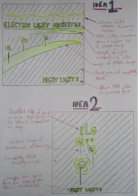
Above is the 2 ideas for the front of the CD cover. I decided that for the design I would play on the theme of lights, coming from the name of the band, "Electric Light Orchestra". I then decided that a nocturnal image of street lights would be fitting, as the music video is for the song "Mr. Blue Sky" and the album could have tracks sequencing as if along the time of day, ending with a song called "Night Lights". "Night Lights" also sounded like a good name for the album, relating to the image.

Idea 1 consists of a street light scene, streaming across the page in the centre, with the title of the band above it underline with a streak of light. The font for the title also would be illuminated similar to the style of a street lamp, as well as the title of the album on the bottom of the page. The background would be completely black to complete the nocturnal theme.

Idea 2 is much simpler than idea 1. It consist of a much simpler design, consisting of a central image. The image would be of street lamps fading out in the distance, with the title of the band on top in the same font as Idea 1. The image would act as the logo for the album, creating a recognisable and simple image for the audience to relate to the album. The background is again completely black, and the title of the album would also be centralised along with the rest of the image, in the same font as the title of the artists.


Above is the designs for the back and inside of the CD cover. Both need to continue the themes of the front of the CD cover to make it recognisable, and to bring the entire CD cover together.

For the back, I have continued the simple design of street lights in a nocturne, and have decided to frame the track information with a street lamp and wavy light pattern. The font for the track information will be the same as on the front cover, however smaller to fit them all in. The wavy light pattern will also act as a border for the legal information in small print, as well as the barcode and production logos, all conventions of a normal CD cover, as found out in research.

The inside of the CD case will also be very simple, with the plastic case being clear so that the images can be seen. on the left of the open case is the back of the leaflet, which will simply be black, with the album logo in the center. behind the CD holster would also be completely black, however with a horizontal wavy light pattern running across, which would also correspond with the CD top itself, which would also have this running across it.