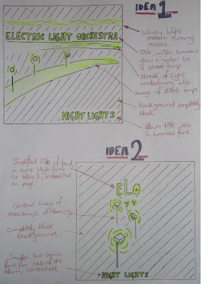
 Above is the 2 ideas for the front of the CD cover. I decided that for the design I would play on the theme of lights, coming from the name of the band, "Electric Light Orchestra". I then decided that a nocturnal image of street lights would be fitting, as the music video is for the song "Mr. Blue Sky" and the album could have tracks sequencing as if along the time of day, ending with a song called "Night Lights". "Night Lights" also sounded like a good name for the album, relating to the image.
Idea 1 consists of a street light scene, streaming across the page in the centre, with the title of the band above it underline with a streak of light. The font for the title also would be illuminated similar to the style of a street lamp, as well as the title of the album on the bottom of the page. The background would be completely black to complete the nocturnal theme.
Idea 2 is much simpler than idea 1. It consist of a much simpler design, consisting of a central image. The image would be of street lamps fading out in the distance, with the title of the band on top in the same font as Idea 1. The image would act as the logo for the album, creating a recognisable and simple image for the audience to relate to the album. The background is again completely black, and the title of the album would also be centralised along with the rest of the image, in the same font as the title of the artists.
 Above is the designs for the back and inside of the CD cover. Both need to continue the themes of the front of the CD cover to make it recognisable, and to bring the entire CD cover together.
For the back, I have continued the simple design of street lights in a nocturne, and have decided to frame the track information with a street lamp and wavy light pattern. The font for the track information will be the same as on the front cover, however smaller to fit them all in. The wavy light pattern will also act as a border for the legal information in small print, as well as the barcode and production logos, all conventions of a normal CD cover, as found out in research.
The inside of the CD case will also be very simple, with the plastic case being clear so that the images can be seen. on the left of the open case is the back of the leaflet, which will simply be black, with the album logo in the center. behind the CD holster would also be completely black, however with a horizontal wavy light pattern running across, which would also correspond with the CD top itself, which would also have this running across it.

No comments:
Post a Comment