My research aided me considerably when making my music video, as it helped me find the conventional shots and effects used. It also helped me understand the different types of music videos. This gave me a basis to make my music video around, to both use particular conventions and develop them in my way. My music video starts off with a prologue, which has no audio. This allows for a build up into the music, and also introduces the storyline. I used a range of conventional shots throughout the music video appropriately, including establishing shots to show location, close ups to show emotion of characters, tracking shots to show movement, and high angle and low angle to establish status, just to name a few.
Also my research taught me about a weather forecast broadcast, which is a feature shot in my video. I found that its all shot in mid to full shot on greenscreen, with the weatherman on the left of the screen, and the forecast backdrop in the background. A way in which I challenge the conventions from a normal forecast is by having a very cartoon style backdrop that interacts with the character at the beginning. This goes well with the fun image of my music video. I used a variety of effects including lighting and colour adjusting to create the feel of the weather changes.
One of my most advanced shots was the chorus shot, which is split into three. I developed this style of shot in a modern way by having the characters interact with each other in the different shots by turning their heads to face the person singing. This adds another comic effect to the video.
I followed many of the conventional rules of filming such as the 180 degree rule, and also occasionally using a shot reverse shot to relate the clips.
I think that my music video is very original in the sense that it plays with the construction of a video. My video despite starting out quite believable, with hints of a comedic tone such as the hand drawn weather report, changes into something very fictional, which would play with the audiences understanding of it. Despite its obvious impossibility of the narrative, the audience is enticed into its comic values, and therefore is a pleasing text to watch.
There also also examples of postmodernism in the video, one being the the play on the fabula and the syuzhet. The character is initially seen in the weather studio, however in the second verse we seem him walking down a road. Later we seem him in a park. The audience can assume that these shots would be during the weather mans lunch break perhaps, however the shots then return to the weather studio, suggesting that the order has been muddled, therefore showing that it is in fact a construction, making this a postmodern element.
Another area in which it can be seen as post modern is the characters interaction with various things. When the character brushes away the clouds in the forecast at the beginning, this play on the conventions of a weather forecast, as the audience know that this cannot be done on a real forecast. Other examples of the characters interaction to a fictional extent is when he wipes away the cloud in the sky, a physically impossible feat, which also plays on the concept of a POV angled shot, all part of the construction. A main challenge of the construction is the chorus shot, which shows the 3 characters from different locations, all interacting with each other in one shot. This challenges the audiences, who understand this is conventionally wrong, however accept it due to its comic aspect and clever structure. The 3 shot discussed are shown below:
By using these modern methods in both my music video and my ancillary texts, I think that I have achieved my overall goal of relating the song, originally published in the 80s, to the younger audience of today. The fun video will relate to youth well, in terms of its use of post-modern humor as well as its up to date techniques in terms of editing, for example the use of greenscreen.
I think that my ancillary texts also have a modern feel to them, allowing the embrace of the youthful target audience with the use of design, such as the "neon font" as well as the modern simplistic layout. The black layout also has very adult and mature iconography also, creating a range for the target audience, linking with the research suggesting that it was a mass audience.
How effective is the combination of your main product and ancillary texts?
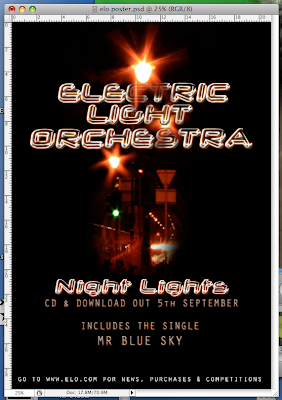
I think that my main product relates to the ancillary texts quite well, as both follow my initial aim of re-creating the song into the modern world. My music video uses various effects and filming techniques that made it an up to date adaptation of the song. The CD cover and Poster was where i could most adapt the modernistic feel to the entire project.
I think that the Poster would entice the audience to buy it with its bold, simplistic appearance. I think the CD cover draws the audience in with its simplicity and is also recognisable as relating to the poster as it is the same style and images. This creates a link between the two. I think the modern interpretation of the music video would please people, as well as the up tempo track which is a feel good song.
I used various techniques to link the two ancillary texts, such as the fonts. By using the same font in both texts for the album title and band name, it immediately creates a link between the two. There is also a significant between the title of the album and the font itself. By adding a glowing effect to the 'Neon' style font in the same colour as the streetlights in the images, there is a relation to the name "Night Lights" and the font itself, creating a connection within the motif of the texts.Another design which links both ancillary texts is the simplicity, as well as the black background, which both emphasises the image and font, as well as relating the the "Night" in "Night Lights", but also creates a base in which the two texts relate.
My use of one key image in both texts not only relates them, but also acts as a logo for the album. With the use of the image in both texts, this allows for the audience to see this image as a symbolic image that is an immediate reference to the album. This could be used in future forms of media and advertising, playing with a modernistic design by simply having a black background and the image in the center, with no text, leaving the audience who have never seen the image before wanting to know where it comes from; And enticing those who have already seen the image to buy the album subconsciously. The picture below demonstrates the links between the texts. The red circles indicate the use of the image or logo, the green indicate the secondary text similarities in terms of font, and the yellow indicates the similarities in the main titles.
- "I think that the music video is very creative, clearly a lot of time has gone into it. I like the variety off effects used, and the story telling. I think that the poster and CD cover are simple but eye catching, however possibly too full of black."
- "I loved the music video, particularly the use of greenscreen. I think the back drop was very clever in the way that it interacts with the character, however i thought the ending shot lasted too long."
- "I thought the CD cover and poster were a bit too simple, however i enjoyed the acting in the music video, i think the character was very convincing."
My intentions for the music video was so that the song could be translated
How did you use media technologies in the construction and research, planning and evaluation stages?
• The Internet - This helped me to research into the various conventions of a music video, with such video streaming websites as YouTube etc. Also the Internet allowed me to publish my work to the worlds so that they could comment on it.


