Wednesday, April 28, 2010

OVERALL EVALUATION

In what ways does your media product use, develop or challenge forms of conventions of real media products?

My research aided me considerably when making my music video, as it helped me find the conventional shots and effects used. It also helped me understand the different types of music videos. This gave me a basis to make my music video around, to both use particular conventions and develop them in my way. My music video starts off with a prologue, which has no audio. This allows for a build up into the music, and also introduces the storyline. I used a range of conventional shots throughout the music video appropriately, including establishing shots to show location, close ups to show emotion of characters, tracking shots to show movement, and high angle and low angle to establish status, just to name a few.
Also my research taught me about a weather forecast broadcast, which is a feature shot in my video. I found that its all shot in mid to full shot on greenscreen, with the weatherman on the left of the screen, and the forecast backdrop in the background. A way in which I challenge the conventions from a normal forecast is by having a very cartoon style backdrop that interacts with the character at the beginning. This goes well with the fun image of my music video. I used a variety of effects including lighting and colour adjusting to create the feel of the weather changes.

One of my most advanced shots was the chorus shot, which is split into three. I developed this style of shot in a modern way by having the characters interact with each other in the different shots by turning their heads to face the person singing. This adds another comic effect to the video.
I followed many of the conventional rules of filming such as the 180 degree rule, and also occasionally using a shot reverse shot to relate the clips.

I think that my music video is very original in the sense that it plays with the construction of a video. My video despite starting out quite believable, with hints of a comedic tone such as the hand drawn weather report, changes into something very fictional, which would play with the audiences understanding of it. Despite its obvious impossibility of the narrative, the audience is enticed into its comic values, and therefore is a pleasing text to watch.

There also also examples of postmodernism in the video, one being the the play on the fabula and the syuzhet. The character is initially seen in the weather studio, however in the second verse we seem him walking down a road. Later we seem him in a park. The audience can assume that these shots would be during the weather mans lunch break perhaps, however the shots then return to the weather studio, suggesting that the order has been muddled, therefore showing that it is in fact a construction, making this a postmodern element.

Another area in which it can be seen as post modern is the characters interaction with various things. When the character brushes away the clouds in the forecast at the beginning, this play on the conventions of a weather forecast, as the audience know that this cannot be done  on a real forecast. Other examples of the characters interaction to a fictional extent is when he wipes away the cloud in the sky, a physically impossible feat, which also plays on the concept of a POV angled shot, all part of the construction. A main challenge of the construction is the chorus shot, which shows the 3 characters from different locations, all interacting with each other in one shot. This challenges the audiences, who understand this is conventionally wrong, however accept it due to its comic aspect and clever structure. The 3 shot discussed are shown below:


By using these modern methods in both my music video and my ancillary texts, I think that I have achieved my overall goal of relating the song, originally published in the 80s, to the younger audience of today. The fun video will relate to youth well, in terms of its use of post-modern humor as well as its up to date techniques in terms of editing, for example the use of greenscreen.

I think that my ancillary texts also  have a modern feel to them, allowing the embrace of the youthful target audience with the use of design, such as the "neon font" as well as the modern simplistic layout. The black layout also has very adult and mature iconography also, creating a range for the target audience, linking with the research suggesting that it was a mass audience.

How effective is the combination of your main product and ancillary texts?

I think that my main product relates to the ancillary texts quite well, as both follow my initial aim of re-creating the song into the modern world. My music video uses various effects and filming techniques that made it an up to date adaptation of the song. The CD cover and Poster was where i could most adapt the modernistic feel to the entire project.

I think that the Poster would entice the audience to buy it with its bold, simplistic appearance. I think the CD cover draws the audience in with its simplicity and is also recognisable as relating to the poster as it is the same style and images. This creates a link between the two. I think the modern interpretation of the music video would please people, as well as the up tempo track which is a feel good song.
I used various techniques to link the two ancillary texts, such as the fonts. By using the same font in both texts for the album title and band name, it immediately creates a link between the two. There is also a significant between the title of the album and the font itself. By adding a glowing effect to the 'Neon' style font in the same colour as the streetlights in the images, there is a relation to the name "Night Lights" and the font itself, creating a connection within the motif of the texts.Another design which links both ancillary texts is the simplicity, as well as the black background, which both emphasises the image and font, as well as relating the the "Night" in "Night Lights", but also creates a base in which the two texts relate.

My use of one key image in both texts not only relates them, but also acts as a logo for the album. With the use of the image in both texts, this allows for the audience to see this image as a symbolic image that is an immediate reference to the album. This could be used in future forms of media and advertising, playing with a modernistic design by simply having a black background and the image in the center, with no text, leaving the audience who have never seen the image before wanting to know where it comes from; And enticing those who have already seen the image to buy the album subconsciously. The picture below demonstrates the links between the texts. The red circles indicate the use of the image or logo, the green indicate the secondary text similarities in terms of font, and the yellow indicates the similarities in the main titles.

 
What have you learned from your audience feedback?


After asking a variety of people about my first draft, the interviews (Shown) gave me a good idea of what to change. These however were not the only feedback but are in fact a select view for the video. Other feedback is shown below, and became clearly consistent. Below are some quotes from what people thought of the 3 drafts:
  • "I think that the music video is very creative, clearly a lot of time has gone into it. I like the variety off effects used, and the story telling. I think that the poster and CD cover are simple but eye catching, however possibly too full of black."
  • "I loved the music video, particularly the use of greenscreen. I think the back drop was very clever in the way that it interacts with the character, however i thought the ending shot lasted too long."
  • "I thought the CD cover and poster were a bit too simple, however i enjoyed the acting in the music video, i think the character was very convincing."
After collecting all of the feedback, i look at the main concerns for each of the texts, and listed them, as shown in the blog. I then addressed the concerns for my final products. I feel that this was a very productive method of working, as it allowed me to gain insight into my target audience, which was primarily youth.

My intentions for the music video was so that the song could be translated
How did you use media technologies in the construction and research, planning and evaluation stages?

 
I used a variety of media technologies to make my music video as listed below:

• The Internet - This helped me to research into the various conventions of a music video, with such video streaming websites as YouTube etc. Also the Internet allowed me to publish my work to the worlds so that they could comment on it.

 
• iMovie - I used a variety of versions to use various effects and transitions such as greenscreen etc. I pieced together the entire video on iMovie.

 
• Photoshop - Various shots in the video are still frames, with the colour of the sky adjusted, to do this i used Adobe Photoshop.

 
• Digital Video Camera - To film the various shots.

 
• High Quality Analog Camera - To film important scenes of the video such as the green screen scenes, so that the effect worked better.

 
• Flash Mx - To create the backdrops for the greenscreen.

 
Various other programmes and equipment was used for much more minor things, such as the tripod for the camera etc.

MAGAZINE ADVERT: FINAL PRODUCT

MAGAZINE ADVERT: AUDIENCE OPINION

MAGAZINE ADVERT REVIEW  click for the link.

**Apologies for the constant reference to the magazine advert as a poster**

What i have learnt:

The poster is too simple looking, possibly due to the attempt to mimic the simplicity of my research magazine adverts.

How i plan to fix it:

  • Bigger main image, taking up more of the page.
  • Make the overall layout a bit more complex.
  • Remove all "amateur" looking font.

MAGAZINE ADVERT: FIRST DRAFT

MAGAZINE ADVERT: MAKING OF

To create the magazine I used Adobe Photoshop, as with my CD cover.  


I started by making an edit to the main image of the CD cover to separate the top light from the other parts of the image so i could overlay it on top of the text.


I then added the texts in relevant positions, making sure that they were all centralised on the page. I copied the various layers of text and edited the transparency to create the effect that the light was beaming over the font. 

I then used the same duplicating layers and playing with the transparency technique to create the other two lights in the background.

Finally I added a different font with the same lighting effect for the added information under the album title, as well as a flat, white font at the bottom for the website.


**This is the making of the final product, not the first draft**

MAGAZINE ADVERT: PLANNING


Above is a very simple plan for my magazine advert. I chose to follow many of the codes and conventions that I picked up from my research, such as the singular colour as the background to emphasis the main image. I also chose to have one image, that was an iconic logo for the album, found on the CD Cover design. The image would be altered slightly however, to make the top lamp sit over the text, as if shining down on it. This would then effect the text at the top, which would be lighter at the top, as if to be shining down on the font. Below the image would simply be the title of the album in the same font as the band name, which would both be identical to the CD cover font. In a different font under the album title would be information about the album, and right at the bottom of the page would be the website of the band.

Monday, April 26, 2010

MAGAZINE ADVERT: RESEARCH INTO SIMULAR MEDIA TEXTS

EXAMPLE 1: MADONNA - HARD CANDY


Above is the poster for Madonna's album, 'Hard Candy'. The poster is reasonably simplistic, with a simple picture of Madonna centralised on the page, wearing a revealing outfit and a wrestlers belt. The belt acts as a symbol of Madonna's 'hardness' relating to the title of the album. She is also in a seductive pose, again relating to "candy" in the album title.The background is very bold and vivid colours, to make the poster stand out. The simple tag line at the top of the page introduces the main title with the use of "...". The main title is centralised on the page, as well as having "New Album" above, and the date of its release on the bottom. The choice of font is very bubble-writing style, which bodes well with the genre of Madonna's music, as well as the girl feel of the poster, emphasised by the pink background and light blue font.
Key Points to Remember:

  • Centralised Title

  • Introduction tag line

  • "New Album" and date

  • Appropriate colour scheme relating to the artist/genre.

  • Appropriate font

  • Simplistic photo
EXAMPLE 2: PINK FLOYD - DARK SIDE OF THE MOON
'Dark Side of the Moon' was an album from Pink Floyd released in 1973, so around the time of ELO. This poster depicts exactly the same as the CD case, however with added text. The very simplistic image became recognised as a symbol of the album similar to the image that i have on my CD cover, and therefore has been used on this poster in the center of the page. The black background emphasises the image, making it bolder and more appealing. In comparison, i also found a modern version of this poster, which i thought would be interesting to look at:

As you can see, the creator of this has taken the famous symbol and modernised it with a more complex design. The realistic beam of light even crashes into a multitude of scattered, realistic colours, as well as the font being far more futuristic and modern.

Key points to remember:


  • Simplistic design

  • Minimal writing, just the band name and album title

  • Symbolic image, logo type iconography

  • Black background, emphasising the image
EXAMPLE 3: COLDPLAY - A RUSH OF BLOOD TO THE HEAD


Above is the poster for Coldplay's album 'A Rush of Blood to the Head'. As with the Pink Floyd album, the poster has only one image centralise on the page. This again is the image shown on the front of the CD Cover, so here it acts as a logo for the album. again, the poster is very simple, with a plain white background to emphasise the picture. The text on the poster is centralised and all under the the image. The font used is exactly the same as the font on the CD cover, again making the connection between the poster and the album.

Key points to remember:

  • One strong image, iconic of the album.

  • Same font as the album cover.

  • Simple background emphasises the image.

  • Legal information at the bottom.


Tuesday, December 1, 2009

CD COVER: FINAL PRODUCT

Front and Inside Left


Back


Inside Right (behind the CD)

CD COVER: AUDIENCE OPINION

CD Cover Review click to see link.

What I have learnt:

People generally seemed to find my CD Cover engaging, with its bold, but simplistic effect. The general messege of improvement however was for more infomation, possibly in the inner covers. One person found the text on the front possibly too small.

What I am going to do:

  • Add a little more infomation in general on the inner pages.
  • Make the titles on the front slightly larger.

CD COVER: FIRST DRAFT


Front Cover and Inside Left


Back Cover


Inside Right

CD COVER: MAKING OF THE INSIDE

1. I have already produced the inside left of the CD cover, as it is the back of the booklet, (seen on the front cover). This simply leaves the inside right of the CD cover to be created. This will be behind the transparent CD holster of the case. To create this i once again used Adobe Photoshop CS4.


2. I firstly began by making it the correct size , which is the same as the back of the CD cover minus the sides.

3. I then opened the image which i wished to use, and used the Select All option to Copy and Paste the image over to the inside cover.


4. After pasting onto the correct canvas, i then positioned the image so that is sat perfectly in the center. I also used the Transform Tool to make the image more circular, to go with the shape of the CD.

Tuesday, November 24, 2009

CD COVER: MAKING OF THE BACK COVER

1. I again used Adobe Photoshop CS4 to create the back of the CD cover. This will make the task simpler as it will create a likeness to the front design, as i will be using the same effects etc.

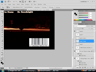
2. I then started a new piece, and measure up the back of a normal CD cover. the measurements were 150mm by 117mm, including 6mm on either side for the sides of the CD cover.
3. I divided it so that the sides were seperated from the central square. I next used the Fill Tool to give it a black background. This will match the front cover and give the entire cover continuity.


4. I then Copied the logo image from the front cover, and Pasted it in. Opening up the image I wished to use for the back cover and using the Polygonal Lasso Tool, i roughly cut round the part of the image i wanted, then Cut and Pasted it in the back cover.

5. After using the Tranform Tool to scale down the image to the correct size, i placed it in the desired position. I then used the Horazontal Type Tool to add the list of tracks for the album. This consists of two colloms. I then used the Blending Options to make them the same style as the title text on the front cover, including effects such as Outer Glow etc.


6. I then then Copied an image of a barcode and Pasted it onto my back cover. Using the Transform Tool, i scaled it to an appropriate size and placed it in the bottom right corner, as found through the conventions of CD covers.

7. As also found in my research, i used the Horazontal Type Tool to create a small print with all the legal infomation on it. I copied the small print of a previous ELO album, but update all the dates etc. This will give the CD cover a further realistic look through detail.


8. I then took a picture of the "Polydor" logo, and used the Transform Tool to scale it down, simular to the size of the small print, and positioned it next to the legal information.

9. I next concentrated on the sides of the cover. I began by using the Fill Tool, and making the background of sides black, to go with the rest of the outside cover so far.
10. I then added the band name and album title using the Horizontal Type Tool, then used the Transform Tool to rotate it to fit on the side. I then Copied and Pasted the text, and rotated it so it fit on the other side.

11. I then added the "Polydor" logo on either side, along with a numerical code in small print, to make it all look convincingly realistic.

Monday, November 16, 2009

CD COVER: MAKING OF THE FRONT COVER

1. I used the programme Adobe Photoshop CS4 to create my CD cover.

2. After opening the programme, I clicked New, and typed in the measurements of the front cover. I worked out by measuring, that the inside booklet of a normal CD cover is 119 mm by 119, so to create a booklet, i had to include the folded back page, leading to a page 238mm by 119mm, and then divided the page in half.

3. I then used the Fill Tool to make the background layer black, and opened the image i was going to use in a different window.

4. Using the Polygonal Lasso Tool, i cut round the part of the image i wanted roughly. I was able to do this roughly as the image has a black background itself, so would blend in well with my background.

5. I then Cut and Paste the image into my CD front cover cover, sclaing and rotating it until i was happy with its positioning.
6. Using the Gradient Tool, I made the edges fade into the background, to create a more cenral and smoother image.

7. I then used the Horizontal Type Tool to create the band name text at the top of the page. I selected an appropriate font which went well with the theme of lights, as it had a neon look to it. I then edited the font by adding particular Effects, such as Bevel and Emboss to make the text stand out more, and Outer Glow, which gives the text a simular glow to the lights in the main image.


8. Next i decided to add another image, as I felt that the cover was possibly too simple. So refering to the photos i took, i found an image which i felt would make an appropriate logo image. I open the image up in a new window again and cut around it, using the Polygonal Lasso Tool. Again this could be rough, as the image also had a black background.

9. I then Cut and Paste the image on to my CD cover, scaling and positioning it so that it was central and a good distance from the other image. I then used the Gradient Tool again to smoothen the edges so that it blended in well with the background.

10. Using the same font and effects as the band name, i created the text for the album title, "Night Lights" Which i positioned underneath both images centrally.
11. I then focused on the back of the booklet, which would be the left half of the opened case. I started by using the Fill Tool and giving it also a black background.

12. I then Copied and Pasted the logo image, Resized it, and placed the copy in the center of the back cover. I also inserted a short bit of text, which simply has a brief number on it in small print, to add to the realism of the product by appearing to be some sort of product code.

Sunday, November 15, 2009

CD COVER: PLANNING

When designing the CD cover i think it is important to take into consideration that the song itself is a quiet old song, as its the band themselves, however I am attempting to re-enter them into modern day times, and i think that the CD cover should show this. Below shows various idea's for the front cover, back and inside of the CD cover.

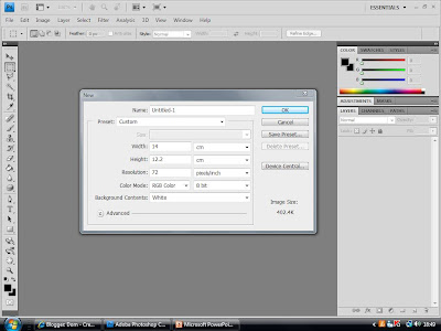
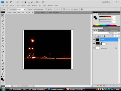
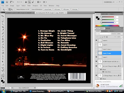
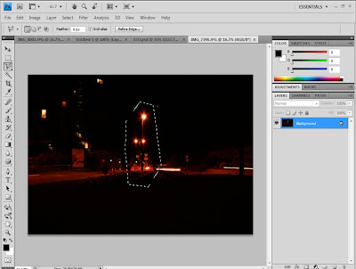
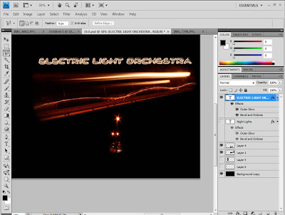
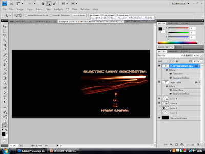
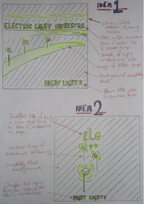
Above is the 2 ideas for the front of the CD cover. I decided that for the design I would play on the theme of lights, coming from the name of the band, "Electric Light Orchestra". I then decided that a nocturnal image of street lights would be fitting, as the music video is for the song "Mr. Blue Sky" and the album could have tracks sequencing as if along the time of day, ending with a song called "Night Lights". "Night Lights" also sounded like a good name for the album, relating to the image.

Idea 1 consists of a street light scene, streaming across the page in the centre, with the title of the band above it underline with a streak of light. The font for the title also would be illuminated similar to the style of a street lamp, as well as the title of the album on the bottom of the page. The background would be completely black to complete the nocturnal theme.

Idea 2 is much simpler than idea 1. It consist of a much simpler design, consisting of a central image. The image would be of street lamps fading out in the distance, with the title of the band on top in the same font as Idea 1. The image would act as the logo for the album, creating a recognisable and simple image for the audience to relate to the album. The background is again completely black, and the title of the album would also be centralised along with the rest of the image, in the same font as the title of the artists.


Above is the designs for the back and inside of the CD cover. Both need to continue the themes of the front of the CD cover to make it recognisable, and to bring the entire CD cover together.

For the back, I have continued the simple design of street lights in a nocturne, and have decided to frame the track information with a street lamp and wavy light pattern. The font for the track information will be the same as on the front cover, however smaller to fit them all in. The wavy light pattern will also act as a border for the legal information in small print, as well as the barcode and production logos, all conventions of a normal CD cover, as found out in research.

The inside of the CD case will also be very simple, with the plastic case being clear so that the images can be seen. on the left of the open case is the back of the leaflet, which will simply be black, with the album logo in the center. behind the CD holster would also be completely black, however with a horizontal wavy light pattern running across, which would also correspond with the CD top itself, which would also have this running across it.

Thursday, October 29, 2009

CD COVER: RESEARCH INTO SIMILAR MEDIA TEXT

I decided to research into CD covers which i own, so that i can analyse them closer by deconstructing them.
Example 1: Jason Mraz - We Sing, We Dance, We Steal Things.

To the left is the front of the CD cover, with the main image. The image is very simple, possibly drawn by a child, with appropriate informal text to match. This simplistic, childish look reflects the genre of the music well, as it is very fun and relaxed. The case of the CD is standard clear plastic, in a rectangular shape, and opens like a book. There is also a sticker on the front, for further promotion of the CD.


To the right is the back of the CD case. As you can see, the text matches the front cover of the CD case, so that it can be recognised as relevant. It is a very simplistic design, with no pictures and a plain white background, with the title of the tracks in order of the playlist. Conventions to note are the track names, the barcode, the legal information, and the producing labels.

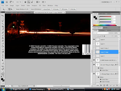
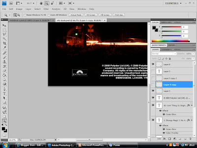
Above is the inside of the CD case. This again is very simplistic, as it has the back of the booklet for the cover of the CD case on the left, which consists of the name of the manager and information, along with more legal information. The CD holster itself is a black translucent plastic, however goes well with the black and white design of the entire case.

Example 2: Take That - The Circus

To the left is the front of the CD cover. It differs in many ways from the previous example, as it is considerably fuller in the sence that the entire page is covered in colour. The image depicts the 4 band members preforming a trapeze act which is appropriate as the album is called the circus. The background has been edited in as a blue sky, and all the band members are wearing blue cloathing, which is a thematic colour of this album. The text is very simple a the top, small but recognisable, and central on the page.


The back of the album cover (to the right) has the same background image of clouds as the front cover. This image is continuous all the way round the album sides, so that the sides match the rest of the cover. The text is again central and the font is the same style and colour as the front cover, and has the infomation in small print at the bottom, simular to the previous example. The barcode for this album was stuck on.

Above is the inside cover. the image is again a blue sky, with the top of a circus tent on the right. The image again appears continuous on the two images, giving a together feel. There is a small logo in the center of the page on the left, which is the "Take That" logo. Unlike the previous example, this case has gone for a more complex design, with a clear, see-through plastic, so that an inside design can be seen.